Dashboard: eCommerce Overview
This dashboard centers around crucial business and commercial performance indicators, offering business owners and managers a swift overview of their business performance within user-defined time periods.
Orders Forecasting
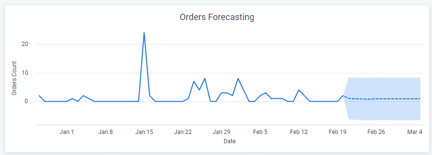
This visualization forecasts future completed orders using a specific model based on historical data and seasonality.
Recent Customers Map
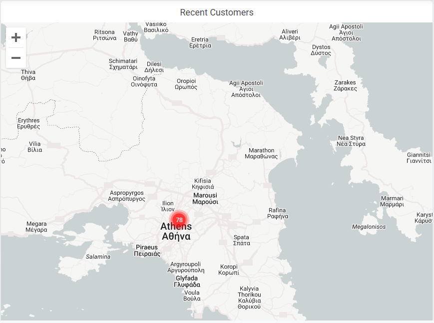
This map visualizes the geographical distribution of aggregated customers for the selected time period, aiding in identifying potential business opportunities based on location.
Revenue - ContactPigeon Revenue - Contribution
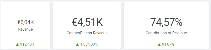
These three scorecards display total revenue generated, revenue from ContactPigeon channels (e.g., email, push), and ContactPigeon's contribution to total business revenue.
Conversion Funnel - All Sessions
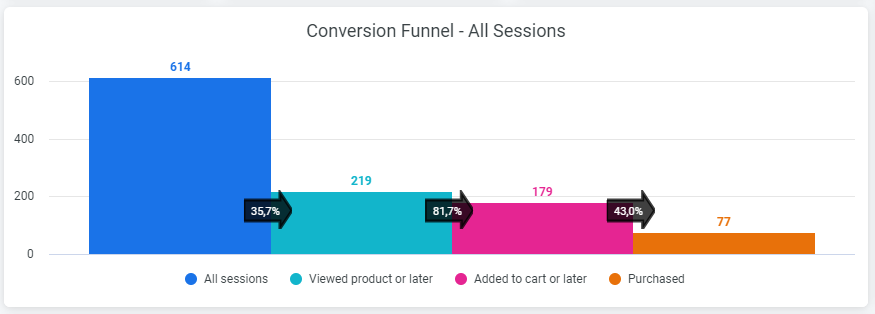
A vital visualization, the funnel analysis, based on total sessions, provides interactive insights into different trends within the funnel process. The "Total Conversion Rate" includes All Sessions and Purchased steps.
Revenue Daily Evolution
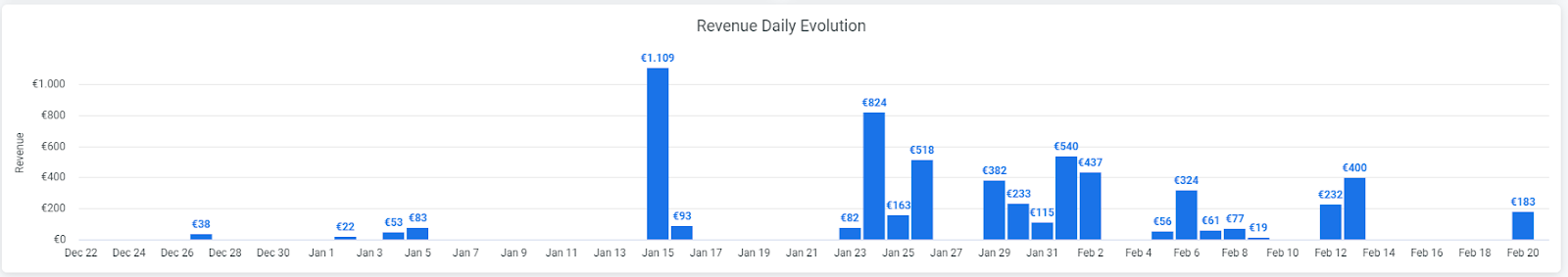
Illustrating daily revenue performance for the selected date range, these figures correspond to the overall revenue, not exclusively ContactPigeon’s revenue.
Funnel Performance - Daily
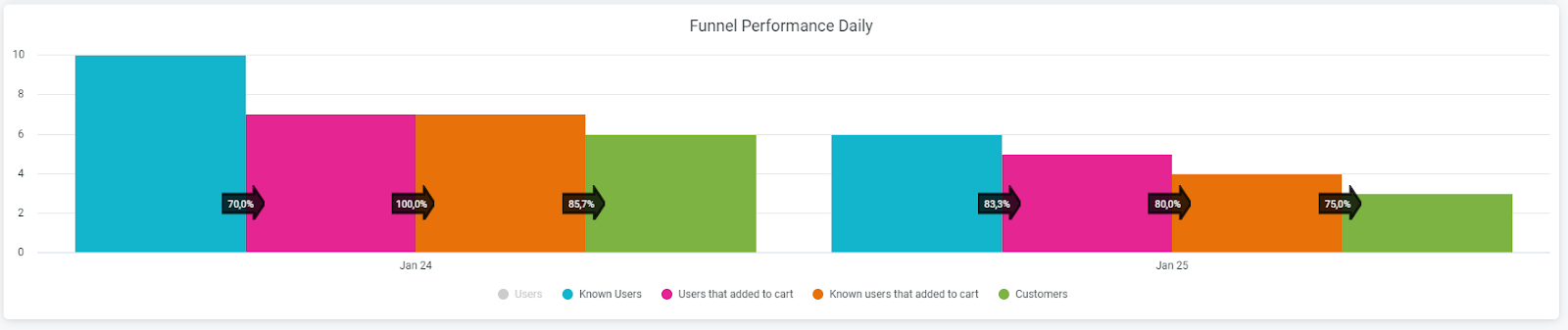
Similar to the Conversion Funnel, this visual includes daily evolution and analysis of the funnel process, allowing users to distinguish the analysis between known and total users.
Commercial KPIs
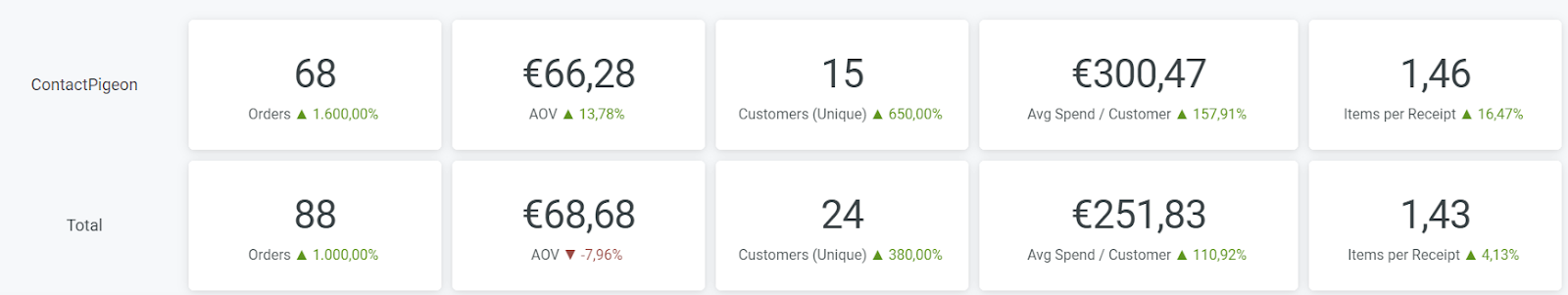
Crucial KPIs for commercial performance evaluation, with the first row corresponding to ContactPigeon-based KPIs and the second showing overall business KPIs. Key metrics include Orders, AOV, Customers (Unique), Avg Spend / Customer, and Items per Receipt.
Orders, Customers, and AOV Daily Evolution
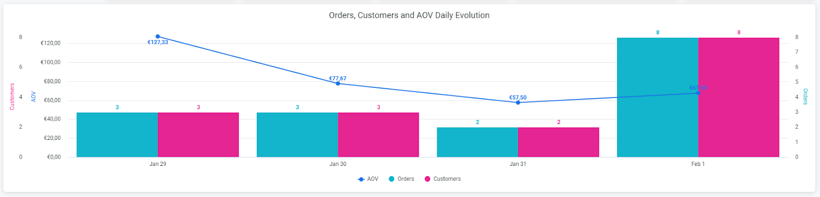
This visualization illustrates the daily evolution of Orders, Customers, and Average Order Value.
Order Flow by Campaign/Channel
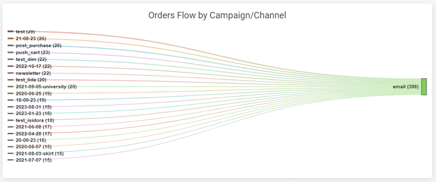
Using a "Sankey" diagram, this visualization shows the flow of orders generated, distributing them based on UTM-based channels and campaigns, helping identify the best-performing channels and campaigns.
Orders Flow by Campaign/Medium/Source
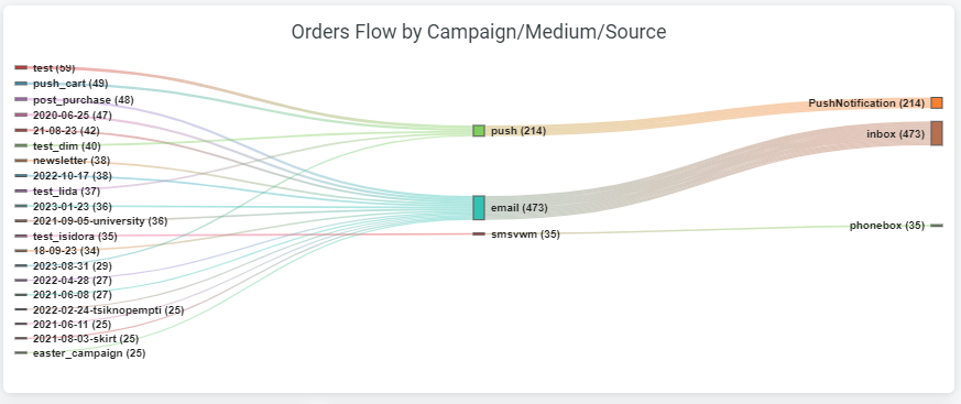
Similar to the previous visualization, this "Sankey" diagram shows flow across UTM-based campaigns, media, and sources.
Customers, Orders, and Revenue by Channel
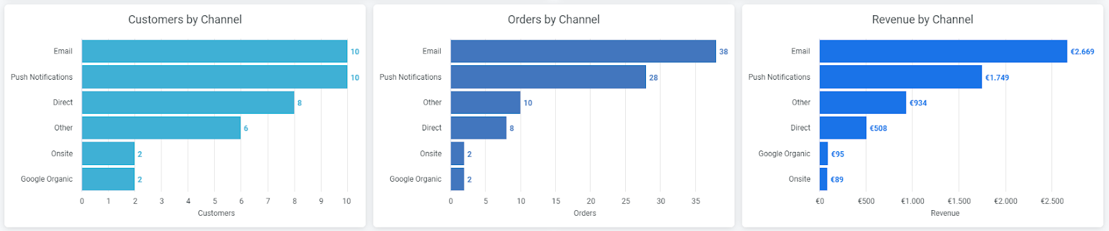
Charts illustrating KPIs (Orders, Customers, Revenue) generated by channels, providing a breakdown for each marketing channel to identify the best-performing channels.
Channels Contribution / Distribution
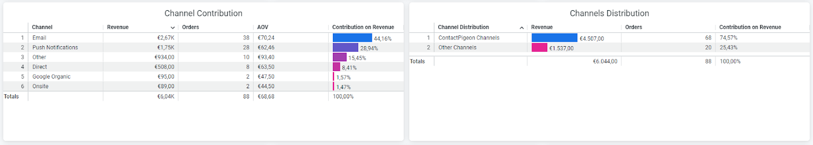
Charts illustrating marketing channels with three basic measures (Revenue, Orders, and AOV), distinguishing between ContactPigeon-based channels and others.
Customers, Orders, and Revenue by Source
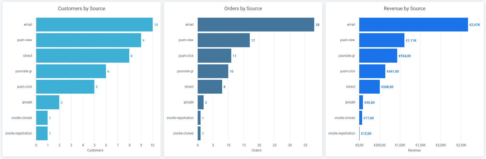
Graphs showing the performance of marketing sources in terms of Customers acquired, Orders made, and Revenue generated.
Known Users by Campaign and Source/Medium
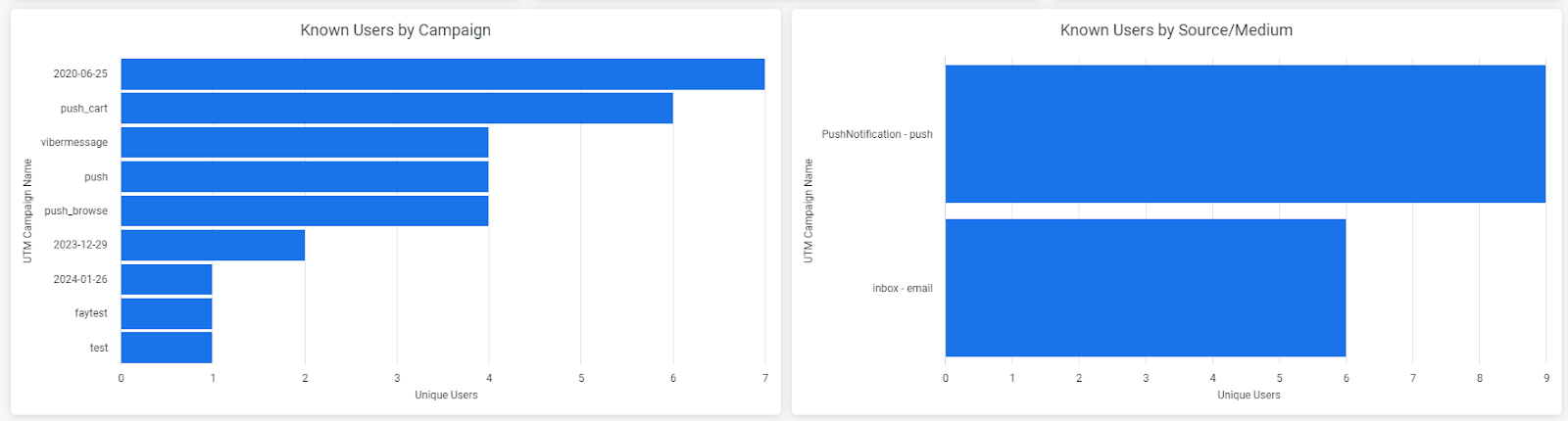
Graphs illustrating Campaign and Source/Medium performance in terms of traffic for Known Users.
Top 10 Categories
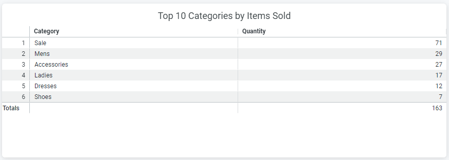
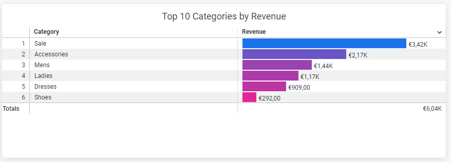
Tables showing the best-performing product categories in terms of quantity sold and revenue generated, based on client-provided XML files.
Top 10 Products
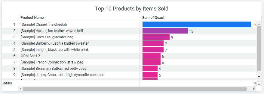
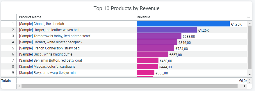
Tables illustrating the best-performing products in terms of quantity sold and generated revenue are also based on client-provided XML files.